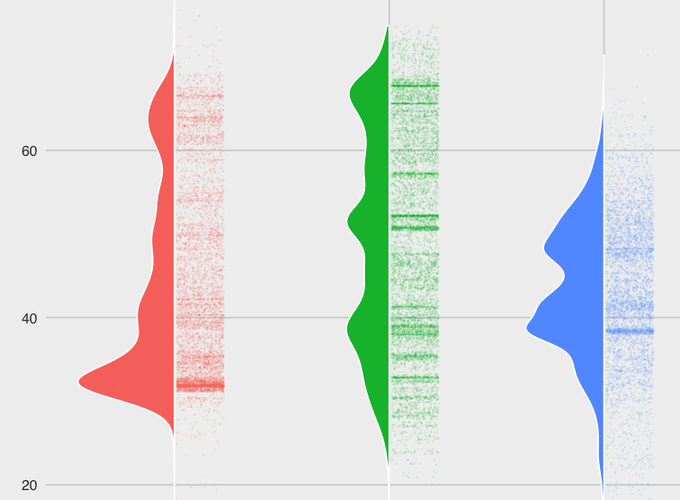
Below is a ipython notebook I wrote with the goal of exploring some genome metadata from NCBI. I set out to use ggplot to try and find some interesting ways to visualize the data. My favourite new plot type is the last one I create below, a half violin/half scatter plot to display the distribution of the data in the three categories. The pairing of the violin plot and the adjacent scatter plot allows a reader to see both the distribution curve via the violin and the scatter plot helps visualize ‘hotspots’ where large numbers of data points cluster. I find these two visuals work well together!
Visualizing GC content of genomes using ggplot